A couple of months back, a company calledrPlan got in touch with me. I am usually very skeptical about almost most emails/inquiries that I receive through SavvyScot if I’m honest… from dodgy freelancers who want to write a post in exchange for 100 high quality link backs, to people wanting to buy the blog outright; most authors will have experienced similar requests. I decided to check it out anyway and was pleasantly surprised. The concept behind rPlan is to make investing easier – the company’s aim is to create an online environment that allows investors to make informed decisions.
First Impressions
Upon visiting their homepage, instantly one fact cried out to me:
49% of investors in the UK don’t know how their portfolios performed in the last year
WHAT?! I mean seriously… come on guys. Tracking wealth is one of the basic rules of personal finance. Over the next couple of days, this statistic got me thinking about why this could be.
- Did people simply have so much money that they didn’t care?
- Did people forget about their investments?
- Perhaps they didn’t fully understand what the investment was?
- Maybe they found it too difficult to understand how to measure performance?
In reality, I think the reason is a combinations of the second two points. Investment tracking is definitely not easy and my guess is that people would rather forget about it and hope for the best. This simply isn’t good enough!
rPlan aims to change this. rPlan aims to make investing easy and give people easy access to key information. In addition to this, there are a number of financial incentives, including a rebate in commission that they receive and capped charges.
Wow this sounds good right? Almost too good to be true! Behold, I have reviewed the product for you! Furthermore, if they deem it to be the best review out of a small series (from other PF bloggers), I could win an iPhone 5… Given that I am highly competitive individual and frequently perform User Acceptance Testing in my career, I have given this some serious research and thought. That said, this review is totally impartial and my honest opinion. To those of you who think this is a boring review and might stop reading… I urge you to continue. There are some great features that I want to discuss!
I’ll start by talking about the overall structure of the site. The site is split into four main areas: Analyze, Invest, Plan and Share. The rPlan website and portal interface has an overall simplistic and minimalistic feel to it – definitely a good start when it comes to investing! While the site is divided into the four distinct areas, the review will focus mainly on the Analytics side – essentially the most important area for an investor.
Analyse
Overview
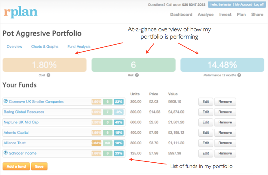
Being able to easily track and analyse your portfolio is key to maintaining it’s health. If you are a visual person like myself, the screenshot below gives you an overview of how the portal looks and feels. There are three main summary boxes:
Cost – This figure represents the total cost that your portfolio carries (usually through Investment fund fees) annually. This is a very important figure and I would highly recommend the team include a feature that calculates the actual cost of your portfolio, instead of just the percentage. This would further simplify making investment decisions. The question marks that you can make out below (next to ‘cost’) expand to give an explanation of the term and an additional link to further explanation.
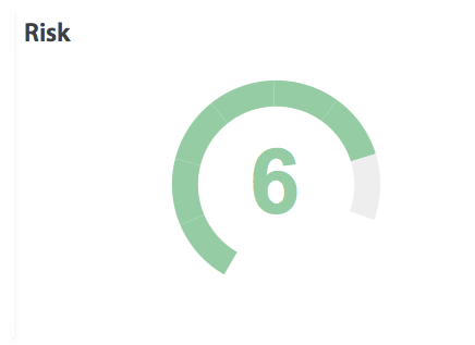
Risk – This currently represents the overall risk of your portfolio on a scale of 1 to 6. I love this feature, however think that a simple modification would make a greater impact – changing the colour of the number as the risk gets higher. For example a low risk level (1) could be Green, a medium risk yellow and a high risk dark red. This would highlight the associated risk better – which is essentially the most important factor of investment. Perhaps a scale of 1-10 would also be easier to understand.
Performance 12 Months – This statistic shows the average performance of your portfolio over the last 12 months. While I think this is a useful feature, I would prefer it to show the percentage gain/loss since initial investment. I feel that this would be a more relevant figure, given that 12 months might not mean much for new investments.
A minor detail, but I think the descriptions could be made bigger. I would also like to see a change in style of the relevant heading you are currently viewing in the text in the top right hand side of the page. For example, I am currently in ‘Analyse’ so would like to see it a different colour / bold / highlighted in some way. This will help overall navigation and understanding of the portal hierarchy / structure.
Charts & Graphs
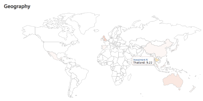
This is where rPlan get’s interesting. As I just mentioned, I am a very visual person and would much rather look at a chart / diagram / picture than read a paragraph of text. The Charts & Graphs section shows 4 main charts: Past Performance, Allocation, Risk, Geography. These charts are simple, yet highly effective.
Past Performance – This shows the past success of your investment over a variable time scale. (3m, 6m, 1y, 2y, 3y, 5y) I think rPlan have done really well to keep this simple, yet give enough variety of presets for changing the time period. Some other finance analytical websites have very complicated sliders and check boxes to change the timescale (which often doesn’t work well).
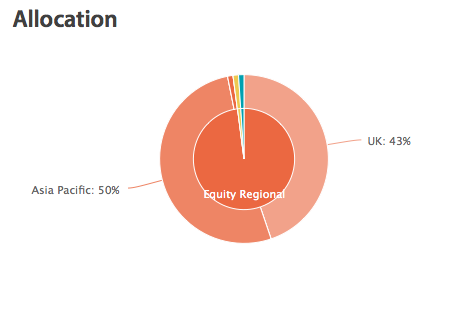
Allocation – This pie chart shows assets by type and category. The labels clearly indicate which countries I have investments in and also the asset type (equity, fixed income etc.) Simple, yet effective
Risk – As before, this shows the calculated level of risk of the portfolio. I feel this chart could be developed further to show dimensional risk – i.e. where the different levels of risk actually come from and to show the overall combined risk.
 Geography – This is quite probably my favourite overall feature of rPlan. A simple world map shows the percentage of your portfolio that is invested in each country. By hovering over a country, the percentage is shown – as demonstrated below with Thailand. I think this feature is absolutely fantastic and a great way to track how investments fund managers change their strategies! I feel this could be further improved by using a better colour scale and to label countries with high proportions of your overall investment.
In summary, the analytics are fantastically simple, yet clear and detailed. The data could easily be extracted into a mobile app to enable you to check performance on the move. Great work guys!
Share
I love this section of the website. Essentially the sharing section is a forum – a platform to discuss investing options and strategies between members. Obviously as I review the product, the forum is very much in BETA testing mode so it is hard to comment on specifics. Furthermore, there is the option to create private groups and restrict access to your boards. Hopefully the team behind rplan have measures in place to monitor insider / illegal trading.
Given that you have to sign up to invest to access the forum, it should prevent trolls / spamming. I am excited to see how the various threads develop.
Closing thoughts
Overall, I love how rPlan has made it easy to obtain a high-level overview of your portfolio – a snapshot of performance. For those of us who are a little obsessed with investments and like to track them multiple times per day (I know I’m not the only one) – this is a very nifty feature! The portal is clean and friendly. Unlike a lot of other financial tools, it is not cluttered and full of uninteresting information. The virtual portfolio provides an excellent way to ‘practice’ investing before you take the plunge. rPlan has a wealth of experience in the start-up team and I am excited to see what the future holds. Good job guys!
Do you currently invest online? If so, are you happy with the analytical capability of your portfolio?

Hi, just a quick note to say thanks very much for the review.
The 49% stat is indeed fairly shocking (it’s youGov research). We suspect that one of the reasons is quite simply that’s it’s not easy to get this type of info – some providers tell you how much your investments have gained since you bought them, which is obviously essential. However, few/none of them tell you how much you have gained/lost over any other period – which makes it hard to tell your investments have been doing well recently, or whether what were previously good investments have been under-performing. This was one of the reasons we developed this functionality – to make it easier for people to understand whether their investments were meeting their expectations.
Thanks again for the review and the kind words.
Good point Nick! Let’s hope rPlan can reach a wide audience!
I think this is great! It is certainly important to know how your investments are doing. Why not make it easier?
Amen
I’ll bet even more than 49% of investors couldn’t tell you what funds their money is in.
I just don’t know how you could work so hard for money, and not even bother to check to see how it’s doing.
justin@thefrugalpath recently posted..Friday’s Fork in the Path: Posts that Kept me on Track 11/9/12
It blows my mind too! 🙂
Because I have a significant amount of money invested in shares, I make a point of reviewing all of my positions on at least a weekly basis for my long term holds and nightly for my short term trades.
I find that if you just leave things without monitoring them, you are in for a world of pain and should probably just leave your money in the bank.
Glen @ Monster Piggy Bank recently posted..Buying Land and Building a House – Part 2
Totally agree. I have money in funds and still check them almost daily!
Anything that might make it easier for potential investors is wonderful in my book. I think fear and not understanding is a huge reason people put it off.
Kim@Eyesonthedollar recently posted..Obesity in America: What It Costs Us
Totally agree Kim – glad you like it
I’m a big fan of any tool that makes investing and understanding it, easier. The problem is getting that 49% to care enough to take a step forward and pursue a tool such as this. Considering that I’m a financial advisor, I’m fairly happy with my graphs and tools that I have. 🙂
Jason recently posted..PerkStreet Financial Review – The Best Online Checking Account
Absolutely agree – simplicity is essential for the average investor! 🙂
Hey, this is a nice review. It will help a lot of scared potential investors. I agree that the reason why people think that investing money on something is not adviceable specially in a weak economy is because they don’t fully understand it.
Alexis Marlons recently posted..10 Good Excuses For Being Late to Work
Thanks Alexis… hopefully it will encourage a lot of people to invest instead of banking their money and funding fat cat’s paychecks!
We just use Questrade to invest. I have to admit, I don’t really use the analytics of the system… :/
CF recently posted..Happy Remembrance Day
Tut Tut Tut
I’m not really sure how your risk can be 6? Can you see your maximum drawdown? Most importantly, who charges 1.8%?
Carlos recently posted..Newly Released Tale – A Transformative Tale